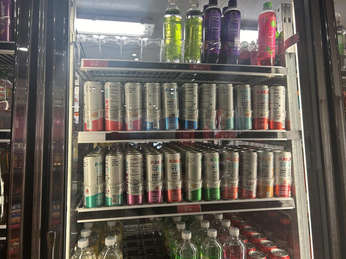
I embarked on a pilgrimage to a land of produce and packaged goods seeking the grand masters of product branding and advertising. The purpose of this quest was not only to acknowledge well-branded products deserving the consumers’ heart, but also to unearth the ungifted brands riding the pine as benchwarmers on an endless roster in the advertising game. The loser stays on its shelf and gets readjusted, fumbled and groped by the acne-ridden stock boy. The winner enjoys times of revelry in your digestive system with other convincingly delicious product.
The first success I spotted was probably the most obvious. There is a reason Toucan Sam has been chirping on shelves’ nests for decades. He is more than just a feathery keeper of fruity loops to children. He is a chef, an entertainer and a dear friend down to hook up a mail-in offer. Sam’s bright, realistic three-color beak serves breakfast in all the colors of the rainbow, widening the eyes of children and head-locking the attention of moms. Because all moms know: Kids like vibrant hues, shiny things and cereals that cut the roof of the mouth.
The neighboring cereal box is not so glorious. Kashi’s “Good Friends” cereal features two really good friends forcing painfully wide smiles over a bowl of oat-like matter. I don’t need friends to eat cereal.
The ogre-sized faces dominate the box cover and take space away from the flaxy-granola goodness. They are certainly trying to appeal to health conscious, middle-aged to older consumers, but the packaging should caution appetite loss. I want to eat the cereal, not an orifice of pearly whites.
Another success: Natural ICE. The icy-blue box and boldly embossed lettering make for a case of beer any competitive collegiate drinker would purchase. The box also features a readable 8 percent alc/vol label that seals the deal for any alcohol enthusiast on a tight budget.
Shur Fine’s “Boil-In-Bag” rice falls far short of triumph. Obviously, the product title is impressive. But aside from that, the discount item definitely succeeds in its expedition for an inferior brand to the same-taste neighboring grains. The package is home to a giant wood spoon of clumpy, seemingly artificial rice, looking like a sno-cone without the blue raspberry syrup. I want that. Whoever the target, it doesn’t matter.
Back to the cereal isle, Special K is another branding smash hit. Targeting women trying to lose weight, the light colors, low calories and “drop a jean size” label on the box create a brand more attractive than the target audience.
On the opposing end of the spectrum, Manny’s tortilla chips offer monotonous packaging on such a festive snack. Targeting adults (mainly moms) getting the patio ready for happy hour, the dull yellow and black “Mexicana” branding should offer up more zesty fiesta, mariachi rock and beautiful beaches that entail UV protection for the kids. Not every brand is fortunate enough to target moms who love to party.
Winner: Gatorade. Gatorade’s branding is amazing. Bright, bold and thirst quenching. They have managed to re-brand this product time and time again with success. Sure, I’ll drink Gatorade AM in the AM. Gatorade Rain. Frost. Loyalty.
And not only does Gatorade fuel athletes, it provides universal refreshment. While those uncoordinated, non-athletic kids will never have a ball in their hand, they just might have a Gatorade.
Loser: Kleenex’s Viva brand showcases “Accents and Borders” on each square of paper towel. If I wanted framed waste, I’d buy Creed’s platinum plaque of “Human Clay.”
My final branding-champion blue ribbon goes to Kraft’s Rugrats Mac ‘n’ Cheese. This traditional kids’ snack is always better when crafted into shapes. Mom is down for the purchase. The packaging includes a delicious, glowing bowl of Mac surrounded by those repugnant Nickelodeon toddlers against a soothing blue background. You know your brand is on fire when poop-soiled diapers can satisfy hunger.
Lastly, Raid needs to re-brand itself away from their authoritative fear appeal. The fierce, evil black and yellow can is home to lightning bolts, dead wasps and wilting weeds. It features the phrases “Kills on contact,” “Sprays 22 ft.,” and “kills in four weeks.” This domestic bear mace would seemingly only appeal to bachelor lawn-junkies favoring Emphysema over an ant in a cleft on the driveway.
So, until next time, buy the genius product whose packaging caught your eye, touched your heart, tweaked your emotions, manipulated your medulla oblongata and then deservingly obtained your money, graciously leaving you with a coupon on the box for next time.
Brett Wisniewski ([email protected]) is a senior majoring in journalism.


